Les Lumières à l’âge du Vivant Corine Pelluchon Nicolas Rodet
22 mai 2026 · Nicolas Rodet
Corine Pelluchon, Les Lumières à l’âge du Vivant
Ce livre a profondément transformé ma perception du rapport que nous entretenons avec le vivant.
Il a été pour moi le déclencheur d’une prise de conscience : la nécessité de passer du « schème » de domination à un « schème » de considération.
Sa lecture éclaire et approfondit également mon propos sur la domination.
Elle permet de mieux comprendre ce qui, dans notre héritage culturel et intellectuel, nous a conduits à penser le monde en termes de maîtrise plutôt que de relation.
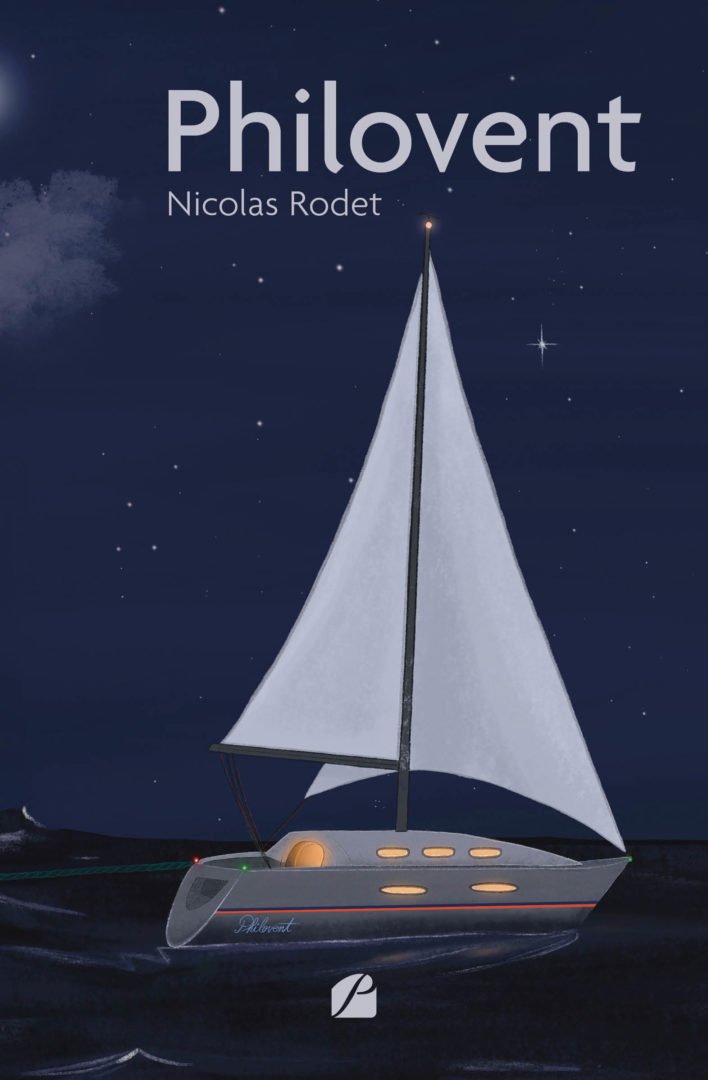
Et si un voyage en mer pouvait changer une vie ? Dans ce roman initiatique, Nicolas Rodet nous livre le portrait d’une femme qui décide de prendre sa vie en main après avoir traversé les mers.
Le Roman
Claire est embarquée dans une aventure qu’elle n’a pas choisie et à travers laquelle elle va découvrir sa force et ses désirs.
Ce séjour se révèle être un puissant voyage initiatique et philosophique. Elle revient de cette navigation transformée et décide de s’emparer de cette expérience pour tenter de sauver son couple.
À travers son roman, l’auteur s’interroge également sur son besoin d’écriture, et le processus de transformation intime que l’exercice lui procure.
« Un voyage en mer comme révélateur de soi — entre philosophie et romanesque, Nicolas Rodet trace le chemin d’une renaissance. »
L’Avis de l’Éditeur
Et si un voyage en mer pouvait changer une vie ? Dans ce roman initiatique, Nicolas Rodet nous livre le portrait d’une femme qui décide de prendre sa vie en main après avoir traversé les mers.
Un premier roman habité, entre quête de soi et désir d’agir.
Extrait
« J’étais projeté en plein mythe de Narcisse, je découvrais non pas la beauté de mon corps dans le reflet de l’eau, mais la profondeur de mon âme sur l’écran de l’ordinateur et, chaque matin, je récoltais avec bonheur ou stupeur ce que la nuit j’avais moissonné.
Un matin, ce ne sont pas que des émotions personnelles qui sont apparues, mais un personnage. Une inconnue a émergé au bout de mes doigts.
Faire la connaissance de Claire fut une rencontre inoubliable. »
L’Auteur
Nicolas Rodet est romancier, résidant à La Roque-d’Anthéron (Bouches-du-Rhône). Animé par une curiosité insatiable pour les questions éthiques et philosophiques, il signe avec Philovent un premier roman initiatique, nourri de ses propres expériences de navigateur et de chef d’entreprise.
Son second roman, Ersatz : Éclats d’IA, explore les bouleversements provoqués par l’intelligence artificielle. Son prochain titre, On-Off, est attendu en 2026.